First read: about 4–6 minutes. Lecture 9: User-generated data.
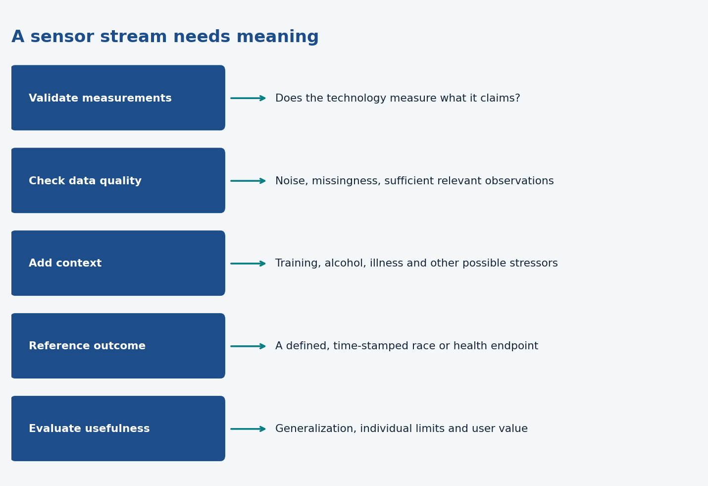
Apps and wearables produce large, realistic data streams that can enable research and new products. Their value depends on measurement validation, quality control, context and a meaningful reference outcome.
The ideas to keep
Blur the explanations and test yourself.
Different workflow. Conventional studies design measurements before collection; product data often exist first. You inherit uncontrolled conditions and may lack the target needed for a new question.
Three steps. Validate technology; deploy and check known relationships; then explore new relationships and applications.
HRV case. Cardiac measurements respond to training, illness, alcohol and other stressors. Context helps interpret a nonspecific signal, and group patterns need not describe every individual.
Quality control. A maximum heart-rate reading may be an artefact. Even accurate easy workouts cannot reveal a maximal effort that never occurred.
Missingness and selection. Deleting incomplete users can select unusually consistent users. A large sample does not repair representativeness or missing reference outcomes.
Reference data. APIs, tags and reports can provide race outcomes or illness context. A positive test date is not necessarily infection time. Targets must be defined and aligned with prior predictors.
Products and cases. The running example predicts a numerical 10 km time; pandemic data explore physiology alongside behaviour. Collecting more data alone does not create a reliable product.
What to be able to do
Be able to critique a wearable-data scenario, explain an API/reference outcome, and connect quality, context and generalizability to the proposed model. The example exams indicate question styles, not an exhaustive syllabus.
Broadly, it is content produced by users of a product. This lecture focuses on sport and health data from wearables and phones: workouts, sleep, heart rate, heart-rate variability, temperature and user annotations.
Examples in the slides:
HRV4Training: cardiac measurements plus context, used to examine physiological responses to stressors.
Bloomlife: uterine and cardiac measurements, with the potential to investigate labour onset.
Oura: sleep and physiological measurements, with the potential to investigate infection.
The common feature is that the data can enable an application beyond the product’s original purpose. Hardware provides measurements; interpretation creates research insights or useful features.
2. The traditional workflow and the new opportunity
A conventional study first defines variables, recruits participants, collects controlled data, analyses them and uses the result. The lecture illustrates this with an HRV study in ten male students.
Controlled measurements can be high quality, but the question remains whether findings apply to other ages, women, different sports, health conditions or everyday conditions. Extending the question may require recruiting again and collecting more data.
Apps and wearables allow longitudinal data collection at scale, in ordinary settings. You can revisit the data to examine different outcomes or subgroups, provided the necessary variables were collected.
That creates opportunities for larger samples, real-life relevance and unforeseen discoveries. It also introduces weaker control over measurement conditions, missingness and who participates. User-generated data change the trade-offs; they do not remove them.
3. Three steps from measurements to knowledge
Validate the technology, or establish its limitations. Can it measure the intended quantity accurately under the conditions where it will be used?
Deploy and reproduce established relationships. Check whether known findings also appear in the field data.
Discover new relationships and develop useful applications. Extend the analysis to new contexts, subgroups or outcomes.
The slides compare phone-camera photoplethysmography (PPG) with ECG for HRV. PPG senses optical changes associated with blood-volume pulses; ECG measures electrical cardiac activity. Validation against a reference method is what makes a new measurement approach credible.
The next step is not simply “collect more.” It is to show that the deployed measurements support sensible interpretation.
4. HRV example: add context to physiology
Heart rate is beats per minute. Heart-rate variability (HRV) describes variation in the intervals between beats. The slides use rMSSD, a metric based on successive beat-interval differences.
The large-scale example reports approximately 30,000 people, data collected over a period described as five years per person, and nine million measurements included in the analysis. Treat these as the slide’s scale description; do not assume everyone contributed the same number of observations.
The graphs show:
Higher-intensity exercise associated with lower subsequent HRV, reproducing a laboratory finding.
A similar broad relationship across age groups.
Sickness associated with higher heart rate and lower HRV.
Higher alcohol intake associated with higher heart rate and lower HRV.
Other possible contexts include the menstrual cycle and different training-intensity categories.
Interpretation: the physiological signal is not specific to one stressor. A change after training cannot automatically be attributed to training if illness, alcohol or another factor also changed. Contextual annotations help distinguish plausible explanations.
These are group-level patterns. They do not tell you exactly how every individual responds.
5. Quality control: why raw sensor data are not enough
The lecture emphasizes noise, inaccurate readings and the frequent lack of reported signal-quality measures. The example workout data include implausibly high heart rates, above 300 bpm.
To describe training intensity relative to a person’s maximum heart rate, you need a reasonable estimate of that maximum. Using the single highest recorded value is vulnerable to an artefact. Statistical filtering can help, but it introduces assumptions.
One assumption is that the person actually performed hard efforts during a sufficiently long observation period. If all available workouts were easy, even perfectly accurate data may not reveal their maximum.
This separates two problems:
Bad measurement: the reading is inaccurate.
Missing relevant experience: the data never contain the type of effort needed to estimate the quantity.
You need automated methods to identify trustworthy observations and clean the data. Only a fraction of the collected data may be usable.
6. Missing data and selection
Workouts may be missing, users may stop logging, or the relevant hard effort may never occur. Removing incomplete users can be practical, but may leave a systematically different sample.
For example, requiring months of complete workout records selects people who regularly log workouts. Results for that group may not generalize to occasional users. More data do not eliminate selection bias.
The lecturer’s message is that there is no universal cleaning or missing-data solution. Ask what information is absent, why it is absent, and how that changes what you can conclude.
7. Reference data: what counts as the answer?
A supervised model needs a target or reference outcome. Wearable users rarely visit a lab or routinely report every outcome a researcher might need.
Possible reference sources include APIs, tags, manual annotations and clinical outcomes. Their timing and meaning matter. For infection research, “symptom onset,” “positive test” and “time of infection” are different reference points.
Before collecting data, ask:
Which outcome would make these measurements useful?
Can we obtain it reliably?
How much reporting burden does it place on users?
Is collecting and using it ethical?
An enormous dataset without a usable outcome can still be unsuitable for the desired model.
8. Example: estimating running performance
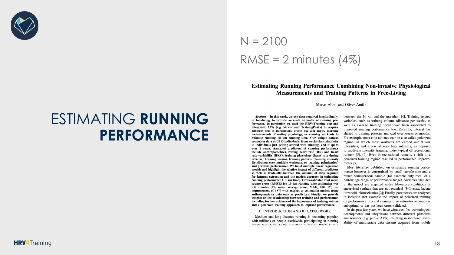
The slides contrast a small laboratory treadmill study with using years of workout data from connected apps. A runner’s best 10 km performance supplies a reference outcome; preceding training provides candidate predictors.
The feature sequence adds:
Anthropometry.
Resting physiology.
Training volume and average speed.
Heart rate during training.
Training-intensity distribution.
Previous performance.
The plots illustrate improved prediction as useful feature sets are added; previous performance gives particularly strong information. The slides report N ≈ 2,100 and RMSE ≈ 2 minutes (4%) for the example. Know what the error means: estimates are imperfect and are expressed on the running-time scale.
The conceptual link to class 5 is straightforward: a numerical target makes this regression, and better predictors can improve prediction. An association between training patterns and faster runners is not automatically proof that changing someone’s training will cause that improvement.
9. Example: behaviour during the pandemic
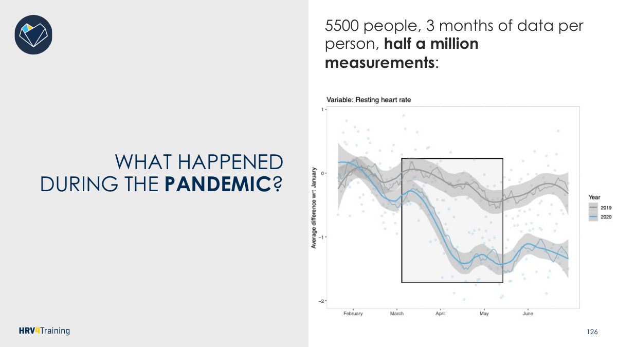
The lecture examines around 5,500 people, three months of data per person, and roughly half a million measurements. It asks how resting heart rate changed during the pandemic and explores contextual changes such as travel and sleep.
The lesson is to investigate physiology alongside behaviour rather than assume one obvious explanation. Again, ask who the users are and whether a group average describes an individual well.
What to retain
A useful data product needs valid measurements + quality control + context + a meaningful reference outcome. Scale helps investigate questions, but it cannot compensate for a missing target, unreliable measurements or unsupported interpretation.
API: the short answer expected in the sample
An API (application programming interface) is an interface through which software requests or exchanges data with another system. For example, an app can obtain a user's available workout records from a connected training platform, then combine them with morning physiological measurements.
An API helps transfer available data. It does not guarantee accurate sensors, complete recording, representative users or verified outcome labels. This definition plus a concrete example answers the kind of short question used in the example exam.
Concrete products in the lecture
The lecturer introduces HRV4Training (cardiac activity and context), Bloomlife (uterine/cardiac activity) and Oura (sleep, cardiac activity and temperature). New applications—managing stressors, studying labour onset or detecting possible infection—can emerge from data collected for an existing product. These are the lecture's examples, not a guarantee that every device makes a valid diagnosis.
Context and reference points make that extension possible. A physiology stream alone does not reliably identify what happened or what target should be predicted.
Follow the HRV case through all three steps
Validate: compare phone-camera PPG-derived HRV with ECG, or use a validated tool. PPG measures optical blood-volume changes; ECG records the heart's electrical activity. Agreement for a specific protocol does not guarantee agreement during every activity or for every user.
Deploy and confirm: the slides describe about 30,000 people and more than nine million measurements, up to years of monitoring. Check whether greater exercise intensity is followed by lower HRV as observed in laboratory work.
Extend: explore age groups, finer training-intensity categories, illness, alcohol, menstrual context and other outcomes. These are observational extensions requiring careful interpretation.
HRV means variability in the timing between heartbeats. It is not simply how fast the heart beats. The lesson is to connect a valid physiological measurement to context and outcomes; neither “higher is always better” nor “a low value means illness” follows from these examples.
Why quality control can dominate this workflow
A conventional study chooses its variables and protocol before recruiting and measuring. A product can accumulate large streams before a research question is decided. In the latter case, the researcher inherits the recording conditions, missingness, devices and available outcomes. Preparation therefore becomes especially important.
Estimating maximal heart rate illustrates this. Filtering implausible peaks addresses measurement noise; having no hard efforts addresses a different problem, lack of relevant observations. A high percentile is less dependent on a single reading than the maximum, but it still cannot reveal a true maximal effort that never happened. Training intensity estimated from an underestimated maximum can then be overstated.
Quality filtering is a tradeoff. Keep unreliable data and estimates suffer; discard too much and the usable sample shrinks or changes. Each subgroup analysis—age, sex, training type, illness—needs enough usable information. A huge total does not guarantee adequate observations for every subgroup.
Reference outcomes and time alignment
A workout API can supply race results or recorded activities, while tags and annotations can supply symptoms, alcohol or other context. An API transfers what exists; it does not validate a label automatically.
For running performance, features must come from training before the target race, using a defined window. Including the target race in “previous performance” would leak the answer into the predictor. Self-selected best performances may also differ from standardized maximal tests; check what the target actually measures.
For infection, an infection date, first symptoms and a positive test are different time points. Calling all three “onset” can obscure lead time and turn an apparent prediction into detection after the event. Also consider ethical permission and the burden of asking users to provide outcomes.
Read the running and pandemic figures
The running plots examine adding information and increasing the amount of training data. RMSE is the square root of mean squared errors, expressed in minutes here. “RMSE ≈ two minutes” does not mean every prediction lies within two minutes: some errors can be larger. The example's “4%” is a relative summary on its performance scale, not classification accuracy.
The running feature plots show that slower-performance quartiles have higher BMI and heart-rate-to-speed ratios and, in this sample, lower training volume. Such comparisons describe the observed runners; they do not prove that changing one characteristic causes the performance difference. The prediction examples show R² about 0.71 with the volume feature set and about 0.87 with the performance feature set, illustrating the information provided by previous performance. R² is not classification accuracy.
The pandemic comparison uses around 5,500 people and half a million measurements. The poll expected resting heart rate mostly to increase, while the data figure shows a decrease during the highlighted first-wave period relative to the January reference and a different trajectory from 2019. Travel decreased and sleep time increased in the accompanying plots. These contextual changes suggest explanations, not independently proven causes.
The horizontal axis is month; the vertical axis is change relative to January, so a negative value is a lower group average than the January reference. Blue represents 2020 and grey 2019. Read differences and timing rather than treating the curve as an absolute heart-rate level. Time trends can have many explanations. Participants who use a wearable/app are not automatically representative of the whole population, and a group mean can hide opposite individual changes.
What makes a useful data product?
Start with a need that can be served, a measurable outcome and suitable data. Validate measurement, prepare it, evaluate a model and communicate uncertainty. More collected data or more intricate algorithms do not create value by themselves. Some questions cannot become reliable products with the available reference outcomes.
The lecture's conclusion is to think critically about preparation, reference points, estimated versus measured quantities, generalizability and individual interpretation. Data engineering is named but explicitly not taught in this lecture; this pack does not introduce an extra engineering syllabus.
Try the interactive explanation
Open the quality-control page. Compare a noisy maximum with a percentile and see why neither proves a person actually reached their true maximum. The page includes a “no hard effort” case so filtering is not presented as a cure for missing information.
From the recording
Points the lecturer made in the lecture recording on Canvas that are not (fully) on the slides. Times refer to the recording.
04:06 — Why continuous user data beat lab snapshots for the menstrual cycle: lab studies typically measured resting physiology once in the luteal and once in the follicular phase. Because day-to-day variability is large, the published results were unclear. Daily measurements by users, with period days annotated in the app, made the cycle-related changes in resting physiology obvious. (Slides p. 17 (app screenshot with a 'Menstruation' tag), p. 41 and 71 (menstrual cycle listed). The luteal/follicular argument is not on the slides.)
08:16 — The reference point for each example application: period days or cycle phase (menstrual cycle), delivery date (Bloomlife, predicting labour onset), and when the person actually got sick (Oura, infection). These markers cannot be read from the physiological signal itself, so when designing a tool you must plan from the start to collect as much context and as many reference points as possible. (The transcript's 'AMG sensor' for Bloomlife is a mishearing; the slide's model uses EHG, i.e. uterine electrical activity.) (Slides p. 19, 21, 25–26 (contextual data and reference points listed in general terms). The example-by-example reference points are spoken only.)
14:30 — Why the three steps matter: in the wild nobody supervises the measurement, so you have to trust that users follow the protocol and don't misuse the device. Step 1: validate the device against a reference in a small lab sample (wrist heart rate during exercise is often wrong, and so are conclusions drawn from it). Step 2: before looking for anything new, replicate a relationship already known from the lab (lower HRV after hard training). If it replicates, the whole pipeline is working, so new findings in step 3 are more likely to be real. (Slides p. 57–59 (lists the three steps). The reasons for each step, especially the 'replicate a known result first' logic, are spoken only.)
20:39 — Age-group result: the HRV (rMSSD) response to training intensity held from age 20 to 60. However, the resting heart rate response to training became very small in older groups, so resting HR may be a less sensitive stress marker as people age. A lab study of young students could not have shown this. (Slides p. 67 (bar charts by age group). The interpretation that HR becomes less sensitive with age is spoken only.)
22:43 — Size of the effects: sickness and alcohol shifted resting HR and HRV far more than training did. He said 'two or three times as large'; on the slide plots the gap is even bigger (rMSSD about −10 to −12% vs about −3% after high-intensity training; HR about +6% vs under +1%). Conclusion: a training-monitoring tool that ignores lifestyle stressors is of little use, because those stressors dominate the signal. (Slides p. 66, 69–70 show the bars, but the comparison and the conclusion are spoken only.)
26:47 — Ethics and consent (Q&A): using app data for research requires an active opt-in under GDPR. The consent box must not be pre-ticked, users can withdraw, and they can have all their data deleted. He said many wearable companies outside Europe use or sell user data for purposes the users never explicitly consented to. (Slides p. 120 only asks 'Is it ethical to collect them?'. Not otherwise on slides.)
48:03 — Users who never train hard: no amount of statistical modelling can recover their max HR. How serious this is depends on how common it is: 3 such users out of 7 is a big problem, 3 out of a million barely affects population results. The data themselves can flag these users, because a very narrow distribution of session heart rates means they always train at about the same intensity. (Slides p. 89 ('But did they ever go hard?'). The 'how frequent is it' reasoning and the narrow-distribution check are spoken only.)
50:08 — Comparing three max-HR estimates for one user: the raw measured max (234 bpm) is an artefact, and the age-derived max (180 bpm) can't be trusted because max HR varies hugely between people (here it is well below what this user actually reached). The cleaned estimate (208 bpm), after removing outliers beyond about 2–3 SD from the mean and the implausibly low values, is the one used to express training intensity as a percentage of max HR. (Slides p. 87–90 (plot titles say outliers = ±3 SD; p. 90 shows the 234/208/180 lines). Why the age-derived value fails is spoken only.)
50:08 — Removing users with missing or poor data introduces bias, and every further stratification (age group, then sport, then type of person) shrinks the sample fast: thousands of users can become 'like seven people' after three subsets. His advice is to remove people only for a very good reason. Prefer improving data quality or finding ways to include them, and otherwise state the limitation when drawing conclusions. (Slides p. 92–95 (bias from removal; 'you can always do one more stratification'). The 'thousands to seven' example and the advice are spoken only.)
52:13 — Resting physiology is sensitive to all stressors but specific to none: a drop in HRV cannot tell you whether training, sickness, alcohol or something else caused it. That is why context and reference data must be supplied, either manually by the user or automatically. (Not on slides as a statement (p. 25–26 and 97–98 only say context and reference data are needed).)
54:15 — APIs can supply context automatically, with no burden on the user. Examples: a weather-service API gives environmental temperature or altitude, so you can study how physiology changes at an altitude training camp and how many weeks it takes to return to normal, without asking the user. A linked workout app (Strava) supplies the training and race data. Low burden matters because this is not a clinical study: ask users too much and they stop complying, and the data become useless (64:31). (Slides p. 26, 98 ('Tags / annotations / APIs'), p. 101 (Strava), p. 120 ('asking too much… not a clinical study'). The weather and altitude examples and the compliance argument are spoken only.)
56:15 — Training patterns linked to a faster 10 km: a higher training load, and less monotonous, more polarized training, meaning a bigger contrast between hard and easy sessions rather than always training at the same intensity. These are associations in observational data, not proof of cause. (Slides p. 107 (box plots of BMI, training load, HR-to-speed ratio and '% non-polarized trainings' by performance quartile). Spoken only: what 'polarized' means and which direction is faster.)
58:19 — 'The best predictor of performance is performance': a recent race or very hard effort in the window before the target 10 km, even over a different distance, improves the estimate most. The model also works without it, just less accurately, so confidence differs between users. A product can show this by giving a range of times instead of a single time. (Slides p. 105, 108–111 (feature sets; R² 0.33 → 0.71 → 0.76 → 0.87). The slogan and the 'report a range' idea are spoken only.)
60:23 — With years of user data you can test how much data a model needs after the fact, instead of fixing the study length (4 vs 8 weeks) in advance. The error drops until about 15 workouts and does not improve after that, so a product can give an estimate earlier but with a larger error. Correction: he said 'a week… 10 days… 15 data points', but the slide's x-axis is the number of training sessions included (5–30), and its caption says 15 workouts. (Slides p. 112 (RMSE/MPE vs trainings included; caption '15 workouts seem sufficient'). The 'test it afterwards instead of designing it in' point is spoken only.)
62:26 — Wearables don't really 'predict' sickness. When the physiology shows a change, the body is already sick, so 'you are detecting at best'. The reference is also uncertain: the infection could have happened on any of the preceding days, and self-reported symptom onset is an assumption. Defining day 0 (physiology change, first symptom or a cluster of symptoms) is a choice the analyst must make (24:46). (Slides p. 21 ('Can we detect (or predict) an infection?'), p. 116–117 ('When did we get infected? How do we determine it?'). The detection-vs-prediction verdict is spoken only.)
62:26 — MyFitnessPal is his example of data with no value: a huge user base logging food, but no reference outcomes (nothing on health or performance). The buyer (Under Armour) could do nothing with the data and resold the app at a loss. This illustrates 'not everything can be a data product; reference points are key'. (He guessed it was resold for a quarter to a tenth of the price. Public reports say about $345M in 2020 versus about $475M paid in 2015. The figures are not exam material.) (Slides p. 118–120, 132–134 make the general point. The MyFitnessPal example is not on slides.)
66:43 — Pandemic finding: people expected resting HR to rise from stress, but it fell, plausibly because there was less travel and more sleep (no commuting). Caveat: the users are a specific, self-selected group of people interested in tracking their health, so even a very large sample does not show what happens in the general population. A group average can also hide individuals whose change was positive and others whose change was negative. (Slides p. 125–130 (poll, plots, 'Who are we talking about? Does this really generalize?', 'group averages'). The self-selection explanation is spoken only.)
72:51 — False positives at scale (Q&A): a 5% false-positive rate means about 1 wrongly worried person in a study of 20, but tens of thousands of false alarms among millions of users (e.g. flooding GPs). The Apple Watch heart-alert example was mentioned. The rate does not change with scale, but the absolute number of false alarms does. (Not on slides.)
81:02 — HRV has little meaning in absolute terms; it is interpreted relative to the person's own 'normal range', a statistical summary of that individual's usual values built from daily morning measurements. In HRV-guided training, a day with suppressed HRV is a poor day for high-intensity training (you may perform, but you adapt less), so the hard session is moved to another day. Studies found this gives better outcomes. (Not on slides (Q&A answer).)
Slide coverage map
Pages 1–27: products and opportunities; 28–50: conventional study design and limitations; 51–73: new workflow and HRV example; 74–95: noise, missingness and quality control; 96–120: reference outcomes, running prediction and sickness; 121–130: pandemic opportunity and limitations; 131–137: conclusions. Progressive slides are consolidated in the explanation while preserved in the full presentation.
Worked through the deep dive?Tick it off. Come back to any section whenever you need it.
3Step 3 of 35–8 min
Practice questions
Exactly two original practice questions. These use the concept/application style of the 2024 and 2022–2023 example exams, with new scenarios and values. Try each before opening its answer. The official example exams are on Canvas; save them for a later, exam-style session.
Question 1 — Critique a maximum estimate
A fitness app uses the single highest recorded heart rate as each user’s maximum. One user has mostly easy sessions and one isolated reading of 315 bpm. Explain two different problems and whether filtering the isolated peak solves both.
Show answer and rationale
Measurement problem: the isolated reading is likely an artefact and can distort the maximum. Coverage problem: easy sessions may never include a maximal effort. Filtering can address a suspect reading but cannot create the missing effort. Rationale: a percentile or robust filter may be less sensitive to one artefact yet still underestimate the true maximum; quality and relevant experience are distinct requirements.
How did your answer compare?
Question 2 — Build a useful study from an existing app
A sleep app wants to predict illness using its existing physiological recordings. Outline the lecture’s three-step approach and explain what a useful reference outcome and an API would contribute.
Show answer and rationale
Validate measurement → deploy/check established relationships → investigate new relationships/products. Obtain a clearly defined, time-stamped reference such as symptom onset or a verified test, noting that neither necessarily equals infection time. An API can exchange available records from another service to help link outcomes/context. Rationale: large physiological streams lack a usable target unless reference information exists; an API does not guarantee valid labels, representativeness or a clinically reliable product.