First read: about 4–6 minutes. Lecture 8: Epidemiological data.
The guest lecture follows a Dutch NO₂–mortality study. It shows how defining a question, estimating exposure, obtaining health records, linking them and adjusting for confounding determine what a large-data result means.
The ideas to keep
Blur the explanations and test yourself.
Hazard, exposure, risk. A hazard can cause harm; exposure is the amount/duration encountered; risk is the chance of harm under the conditions.
Precise question. The case concerns Dutch adults over 30, long-term NO₂ exposure and all-cause mortality during follow-up. Change those elements and the required data change.
Exposure proxy. Residential concentration approximates personal exposure. Routine stations do not measure every address, so land-use regression predicts concentration from traffic/land-use information.
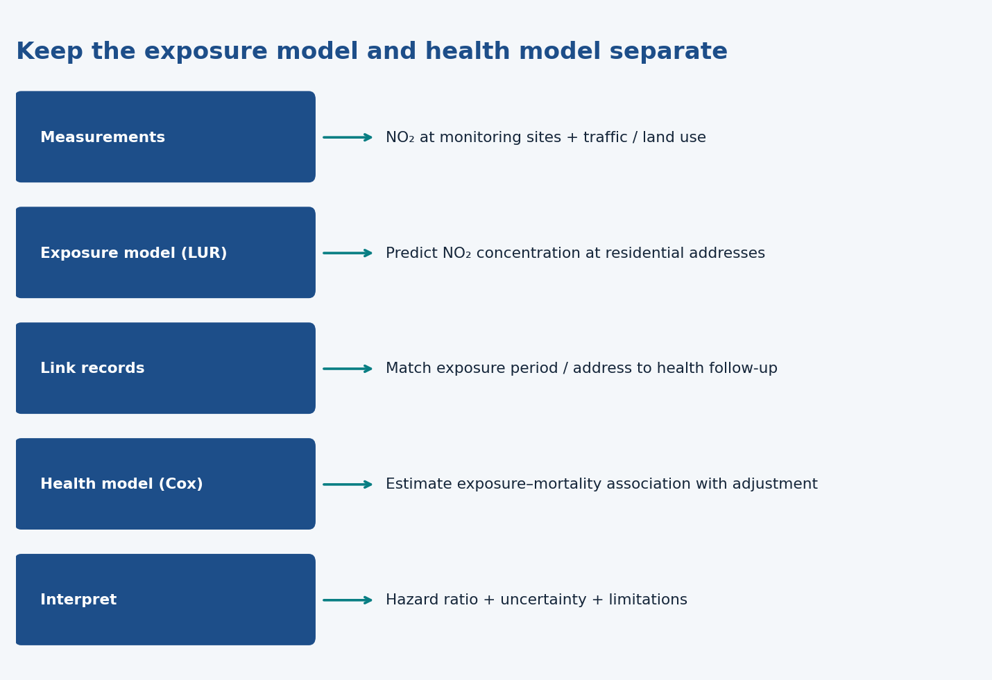
Two models. The exposure model predicts NO₂ concentration. The Cox health model estimates its association with mortality, using follow-up and adjustment variables.
Health sources. Registries provide scale; questionnaires provide reports/context; biomarkers provide physiological measures. Each has distinct quality, cost and privacy concerns.
Confounding. Other characteristics can affect both exposure and outcomes. Adjusting measured confounders helps, but does not eliminate all bias or prove causation.
Interpretation. HR 1.04 is about 4% higher hazard for the stated exposure increment, not four percentage points higher mortality probability. Statistical significance and practical importance are different questions.
What to be able to do
Be able to propose suitable exposure/outcome data, explain linkage/proxies/confounding, and interpret the ratio with its uncertainty and limits. The example exams indicate question styles, not an exhaustive syllabus.
1. Environmental health: hazard, exposure and risk
Environmental health examines external physical, chemical and biological factors that affect health, and how to assess or control them. Examples include heat, air pollution, pesticides, noise and microplastics.
Hazard: something capable of causing harm.
Exposure: how much, and for how long, a person encounters the hazard.
Risk: the chance of harm under the relevant exposure conditions.
A hazard’s existence alone does not tell you an individual’s risk. Dose, duration and population characteristics matter.
The lecture’s risk-assessment sequence is:
Hazard identification: can the agent cause harm?
Hazard characterization: how does harm depend on dose/exposure?
Exposure assessment: what levels, types and durations does this population encounter?
Risk characterization: what are the consequences at current exposure levels, and what could exposure reduction achieve?
The deck distinguishes toxicology, physiology, One Health and environmental epidemiology. Their emphasis is respectively toxicity mechanisms, physiological responses, connections between humans/animals/ecosystems, and the distribution of disease and its environmental determinants.
2. Define the study question precisely
The case study specifies the Netherlands, adults over 30, NO₂ exposure, all-cause mortality, and long-term follow-up of ten years.
Those choices determine the data needed. A study of short-term asthma symptoms would need different exposure timing, outcomes and models.
NO₂ comes from combustion sources, including traffic, power generation and heating. Traffic-related pollution varies substantially across locations. One national average would therefore hide important exposure differences.
3. How to estimate exposure across a population
True personal exposure changes across home, work, travel and other settings. Measuring all of those environments for everyone is usually impractical. The lecture uses average concentration at the residential address as a proxy for personal exposure.
A proxy is an approximation. It can be useful without perfectly representing what each person actually inhaled.
Measurement source
Advantage
Limitation
Specially designed campaign
Choose pollutants and relevant locations; fixed or mobile measurements
Costly and limited coverage
Routine monitoring network
Long-term, repeated measurements at relatively low additional cost
Sites or measured components may not match the research question; spatial density can be insufficient
Remote sensing (satellite data; a type of routine monitoring network, alongside surface monitoring)
Free, wide spatial coverage, long time series
Coarser spatial resolution (about 1–25 km in the predictor table); suitability and measurement quality still need evaluation
To estimate concentrations at unmeasured addresses, the slides distinguish deterministic models, based on physical dispersion/transport laws, from statistical models, which learn measured concentration patterns.
Land-use regression (LUR)
Measure pollutant concentrations at a limited set of sites.
Obtain predictors such as traffic and land use.
Fit a regression or ML model explaining concentration differences.
Apply it at unmeasured locations, such as participant addresses.
The lecture example uses 69 monitoring sites. Model choice, measurement quality, uncertainty and validation all matter.
Keep two models separate: LUR predicts exposure from location characteristics. The later health model estimates the association between exposure and mortality. They have different targets and different purposes.
4. Where health data come from
The slides cover three broad sources:
Source
Useful because…
Main concerns
Routine databases/registries
Large populations, low cost, consistent records, sometimes the only feasible source for rare outcomes
Quality of information, completeness, dependence on administrative factors (e.g. more deaths are registered on Mondays than Sundays because of registration practice and medical shifts, not real mortality differences) and privacy regulations
Questionnaires
Can reach many people and capture symptoms, diagnoses, medication or quality of life
Wording, standardization and how questions are administered
Physiological measurements
Can capture biomarkers earlier in a disease process
Cost, time, invasiveness and instrument/observer effects
For the NO₂ question, link residential exposure with follow-up and mortality, plus relevant participant characteristics. Check that records, definitions, timing and missing information are suitable before fitting a model.
A large dataset can still have systematic measurement or selection problems. More observations do not automatically repair poor data.
5. Describing data versus estimating an association
Descriptive analysis summarizes who is in the dataset, exposure distributions and outcome frequencies. It helps you understand the data and spot problems.
Model-based analysis quantifies associations and their uncertainty. The lecture mentions parametric, semiparametric and nonparametric approaches. Examples include regression, Cox models and tree-based methods. Each approach has assumptions; models cannot be applied blindly.
A simple correlation is inadequate for the lecture’s mortality question, particularly because of confounding. A confounder is related to exposure and the outcome and can distort their apparent relationship. The health model includes factors such as smoking and socioeconomic characteristics rather than attributing every difference to NO₂.
Adjustment helps address measured confounding. It does not by itself turn an observational association into proof of causation.
6. Relative risk, odds ratio and hazard ratio
Measure
What it compares
Relative risk (RR)
Event probabilities over a specified period
Odds ratio (OR)
Event odds
Hazard ratio (HR)
Event rates at a given time among people still at risk
All three have 1 as the no-difference value. They are not interchangeable. Class 7 explains why odds and probabilities differ.
The case study uses a Cox proportional hazards model:
h(t)=h_0(t)exp(β_1X_1+β_2C_2+…+β_nC_n)
Here h_0(t) is the baseline hazard, X is exposure, and C represents adjustment variables. The proportional-hazards assumption means the compared hazards have a constant ratio over the relevant time scale.
You do not need to memorize the long R formula. Understand that it combines follow-up/mortality, NO₂ exposure and adjustment variables.
7. Interpret the slide result carefully
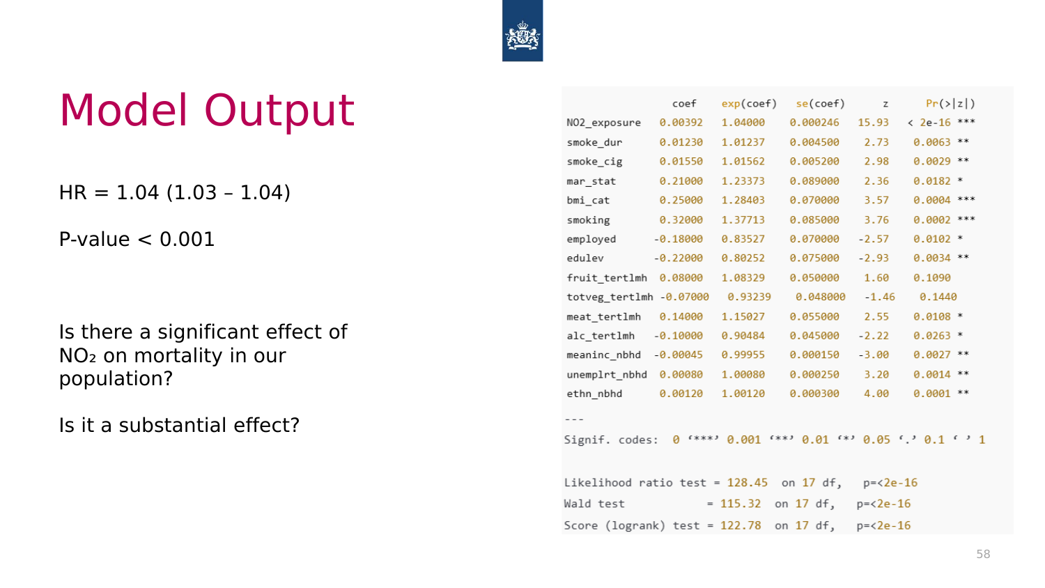
The deck reports HR = 1.04, with interval 1.03–1.04, and p < 0.001.
For the exposure increment used in that model, HR 1.04 indicates a 4% higher hazard, after the stated adjustment. The conclusion slide (p. 72) describes the increment as one unit of NO₂ exposure (µg/m³) and words it as 'the mortality risk increases by 4%'. Strictly, that is a 4% higher hazard (instantaneous rate), not a 4% higher 10-year risk. The results slide (p. 70) uses a different increment: HR about 1.065 (about 1.05–1.08) per interquartile range, next to a non-linear exposure–response curve. Always check which increment an HR refers to. (The printed NO₂ coefficient on p. 69, 0.00392, actually equals ln(1.04)/10, i.e. 1.04 per 10 µg/m³, the increment the speaker gave as her example. For the exam, follow p. 72's '4% per unit'.)
This is not a four-percentage-point rise in absolute mortality probability. The reported interval describes uncertainty around the estimated ratio; the p-value addresses evidence against the null under the model’s assumptions. Neither establishes that the effect is large in practical terms or that NO₂ caused each observed death.
The lecture asks two separate questions: is the association statistically detectable, and is it substantial? A modest relative association can matter across a large exposed population, but interpretation needs the exposure contrast, baseline outcome frequency and data limitations.
Applying the sample's data-selection question
For daily mortality versus peak temperature, hourly readings let you derive daily peaks; an already averaged daily temperature can hide those peaks. Several stations help represent spatial variation better than assuming one location represents an entire country. Exposure can then be aggregated and linked to daily outcomes.
This is the principle tested in the example exam. For the current NO₂ lecture, explain the corresponding need for location-specific estimates, a suitable long-term exposure period and correctly linked health outcomes.
What “health” and “environment” mean here
The lecture starts with the WHO definition emphasizing physical, mental and social well-being, and critiques the requirement of “complete” well-being as impractical. It offers the alternative of being able to adapt and self-manage in the face of challenges.
Environment means external conditions affecting life, development and survival. The lecture's environmental-health definition emphasizes external physical, chemical and biological factors and associated behaviours, such as safe water or urban design supporting activity. The definition used on the slides excludes genetics and distinguishes other social/cultural behaviours from this narrower environmental scope.
A data pipeline with two distinct predictions
A monitoring-site table has concentrations and local traffic/land-use predictors. The exposure model learns to predict NO₂ concentration at an address. The health table has participant identifiers, address, age at entry/exit, sex, smoking and mortality. Link the predicted exposure to each participant with the appropriate address and period, then fit the health-association model.
This creates several places for error: a monitoring site may be unrepresentative, an address may be outdated, exposure may be assigned to the wrong period, or a mortality record may be incomplete. The large number of participants does not make those errors disappear.
Designed campaigns provide control over sites and pollutants but cost more and can lack coverage. Routine stations give continuous long-term measurements but may be sparse or not measure the desired component. The deck includes Dutch/EU monitoring networks and remote sensing via Google Earth Engine as examples of sources, not a requirement to use those websites while commuting.
The slide, adapted from Galetsi et al. (2020), lists four categories: clinical data (clinical endpoints such as disease incidence or mortality), real-time patient data (wearable sensors, e.g. smartwatch heart rate, sleep, steps), administrative data (costs and reimbursements of medical expenses; sometimes a proxy when clinical data are too sensitive to access) and pharmaceutical data (toxicological effects of drugs, medicine use). (The paper itself lists five types, adding databases, and calls the second one patient behaviour and sentiment.) Routine mortality/morbidity/hospital/birth registries, questionnaires and biomarkers answer different questions. Compare the endpoint definitions before combining records.
Statistical model families
Parametric models use a specified functional form with parameters to estimate. A straight-line regression is one example. Semiparametric models specify part of the relationship while leaving other parts flexible; Cox regression leaves the baseline hazard unspecified. Nonparametric methods such as trees make fewer fixed-form assumptions, but still have assumptions and limitations.
The lecture table's labels are broad teaching groupings. The goal is to justify a method using the question, outcome, data and assumptions—not to treat a complex model as assumption-free.
The displayed Cox formula uses age at beginning/end and mortality, NO₂ exposure, sex stratification, smoking measures, BMI, marital/employment/education characteristics, diet/alcohol and neighbourhood socioeconomic variables. Sex stratification allows separate baseline hazards; the listed covariates aim to address measured differences that could confound the exposure association.
Statistical significance versus practical importance
The slide's exposure summary is mean 25.41 µg/m³, SD 4.80, with range 11.23–44.11. These describe this example dataset, not every Dutch person's exposure.
HR 1.04 is a multiplicative ratio for the specified exposure increase. Under the displayed log-linear model, a five-unit difference corresponds to 1.04^5 ≈ 1.217, about 21.7% higher hazard, if that model is appropriate across the contrast. It is not a 20-percentage-point probability change. This calculation illustrates interpreting the coefficient scale, not an extra course topic.
A confidence interval excluding 1 and a small p-value indicate statistical evidence under the model. Whether the association is important depends on the exposure contrast, population size, baseline risk, uncertainty and bias. A hazard describes the event rate among those still at risk; it is not the same quantity as the cumulative chance of dying over ten years.
Try the interactive explanation
Open the hazard-ratio page. Vary an exposure contrast to see the ratio implied by the slide's multiplicative model. The page makes the missing baseline-risk information explicit and does not manufacture an absolute mortality probability.
From the recording
Points the lecturer made in the lecture recording on Canvas that are not (fully) on the slides. Times refer to the recording.
02:04 — The WHO 1948 definition was praised because it was the first to define health positively (complete well-being), not only negatively as the absence of disease. Its critique: 'complete' well-being is utopian and cannot last (any flu or chronic disease would make you 'unhealthy'), hence the newer definition of health as the ability to adapt and self-manage. 'Environment' in environmental health includes the built environment (houses, neighbourhood design, nearby schools and facilities), not only the natural environment (air, green and blue spaces). (Slides p. 4–6 (definitions and the 'utopian' critique; the positive-definition point and the built-environment examples are verbal))
06:14 — Environmental hazards are classed as physical (e.g. heat, noise, particulate matter), chemical (e.g. pesticides, microplastics, gases such as NO₂) or biological (bioaerosols such as viruses, bacteria, moulds and pollen). Air pollution itself can be chemical, physical or biological, and most pollutants come from human activity. (Slides p. 7, 10 (lists the problems but does not sort them into physical/chemical/biological))
06:14 — The approaches map onto the risk-assessment paradigm: toxicology characterises the hazard itself (its toxic properties), physiology studies how the hazard affects the body, and environmental epidemiology (and One Health) covers the second half of the paradigm: assessing population exposure and characterising risk, i.e. how disease is distributed and what its environmental determinants are. (Slides p. 9, 11 (paradigm and approaches shown separately; the mapping between them is verbal))
10:18 — Short-term effects = health effects of today's exposure (e.g. what happens in the following days); long-term effects = effects of exposure sustained over years (here a 10-year average). Before analysis you narrow the question by fixing study area, population, one or a few exposures (there are hundreds of pollutants), an outcome that the exposure could plausibly affect, and short- vs long-term. (Slides p. 16–17 ('Short vs. long-term' listed without definition))
12:22 — Why the residential address is the proxy: people visit many micro-environments each day, so true personal exposure cannot be measured for a large population; researchers assume people spend most of their time at home. NO₂ is very high next to roads and drops sharply with distance, so each person needs an address-specific estimate rather than an area average. (Slides p. 21–22 (state the proxy and 'large spatial variability'; the 'most time at home' assumption and the steep road gradient are verbal))
16:24 — Remote sensing means satellite data; together with surface (ground) monitoring it is a type of routine monitoring network. Routine network data are free/open access, go back decades (useful for historical/long-term exposure) and each station measures several pollutants at once; satellite data have coarser spatial resolution. The Dutch network (Luchtmeetnet) gives hourly concentrations. (Slides p. 25–27 (lists surface monitoring and remote sensing under routine networks; 'satellite', 'historical' and 'coarser resolution' are verbal))
18:25 — Two ways to predict concentrations where nothing is measured: deterministic models (dispersion or chemical transport) start from the pollution sources and their emissions and use physical/chemical laws to predict how pollutants travel away from the source; stochastic/statistical models such as land-use regression ignore sources and emissions and start from measured concentrations, interpolating them to unmeasured locations. (Slides p. 30–32 (titles only: 'Deterministic – physical laws' vs 'Stochastic – statistical (LUR)'))
22:33 — Always inspect downloaded data before manipulating it (summarise and plot). The hourly boxplots show weekday NO₂ peaks at the morning rush hour and a smaller evening peak (traffic), lower values at weekends, and higher values in the cold season (heating adds NO₂). The prediction maps show the same: e.g. 8 a.m. on weekdays higher than 12:00. Plotting only the medians is a simpler alternative to crowded boxplots. (Slides p. 35–36, 40 (plots and maps shown without interpretation))
24:33 — How LUR learns: the outcome (Y) is the measured concentration at each station and the predictors are the land-use characteristics around it. If stations surrounded by more roads have higher NO₂, roads get a positive coefficient; if stations surrounded by green areas have low NO₂, green area gets a negative coefficient. The fitted equation is then applied to any location whose land use is known. The speaker said 'the more predictors, the better'; strictly, more predictors can overfit a model built on only 69 stations, which is one reason validation is needed. (Slides p. 33, 37–39 (steps and predictor table; the sign reasoning is verbal))
26:37 — Validating the LUR model: you can measure yourself at predicted locations (time-consuming), but the usual approach is a hold-out check: fit the model on part of the stations (e.g. 40 of 69), predict at the remaining stations and compare predictions with measurements; a good correlation suggests it will also predict well at unmeasured addresses (an assumption, not a proof). Also check input data quality first: a model built on bad data makes no sense. (Slides p. 41 (lists 'model verification and validation' and 'quality of routine monitoring networks' only))
30:43 — Of the four health-data categories (Galetsi et al. 2020), real-time patient data are e.g. smartwatch heart rate, sleep and step counts, and administrative data (healthcare costs/reimbursements) can serve as a proxy for clinical data, which are often too sensitive to access: you may not know the diagnosis but know that someone paid for certain therapies. (Slides p. 44 (categories and examples; the proxy use is verbal))
32:46 — Routine databases depend on administrative factors: the mortality registry shows more deaths on Mondays than on Sundays, not because people die more on Mondays but because of registration practices and medical shifts. Questionnaires: bias from wording and from mode of administration (interview vs written), and pooling questionnaires from different sources is hard when wording differs or answers are open. (Slides p. 46–47 ('depends on administrative factors', 'wording', 'mode of administration' listed without examples))
39:03 — Data processing is usually the most time-consuming step: a registry gives a date of death, not 'outcome yes/no', so you derive a 0/1 outcome (1 if the person died within the 2009–2019 follow-up). Choose the endpoint to match the exposure (e.g. for smoking you would look at lung cancer), and check there are enough events to analyse. (Slides p. 52–53 (analysis table and 'data processing' challenge; the derivation and endpoint example are verbal))
56:43 — Parametric models assume one fixed functional form (linear, polynomial); non-parametric models assume none and infer the shape from the data (more flexible); semi-parametric models assume part of the form and leave the rest flexible. Example: splines are a chain of polynomials whose shape changes with the exposure level, e.g. temperature–mortality is roughly linear at low temperatures but rises steeply at high temperatures. Model choice: look at what others did and at your own data. (Slides p. 57 (table of model families; splines and the temperature example are verbal))
60:48 — Cox regression was chosen because it is semi-parametric and the standard model for long-term survival (time-to-event) studies: the time until a person experiences the outcome. The HR is computed for a fixed increment in concentration; her example was 10 µg/m³ (she said 'micrograms per meter square'; air concentrations are per cubic metre). HR = 1: no association; HR > 1: positive; HR < 1: protective. She said 'if the hazard ratio is negative, so it's lower than one'. An HR cannot be negative; it is the coefficient (log HR) that is negative when HR < 1. (Slides p. 63 (HR definition and the 1/>1/<1 rule; the survival rationale and 10 µg/m³ example are verbal))
64:50 — Reading the Cox output: the model calculates exp(coef), which is the HR (1.04 for NO₂); coef is the log HR, followed by its SE, z and p-value. The baseline hazard h0(t) is the hazard when all covariates are 0, because exp(0) = 1. In R, Surv(age_b, age_end, mort) sets the time scale (age at start and end of follow-up) and the death indicator. She calls this 'the baseline hazard', which is loose: Surv() defines the outcome, not h0(t). Note the printed NO₂ coef (0.00392) actually gives exp = 1.004 per µg/m³; 1.04 corresponds to a 10 µg/m³ step, matching her 10 µg/m³ example. The exam will likely follow the slide's '4% per unit'. (Slides p. 67–69 (formula, R code and output table; how to read the columns is verbal))
66:59 — Significant vs substantial: yes, significant (HR > 1, p < 0.001). Substantial? 4% per unit looks small, but it is a typical size for a very large population study, and an HR is not a measure of health burden: to judge public-health impact you need to know how many people are exposed and to which levels. A student read 1.04 as '104% risk'; the correct reading is 4% higher hazard per increment. (Slides p. 69 (poses both questions without answering them))
69:07 — The exposure–response curve applies the HR across the whole exposure distribution: risk rises with concentration, and the study population is exposed to potentially harmful levels but not at the extreme end of the curve. She did not explain that the left panel of the results slide is per interquartile range (HR about 1.065, CI about 1.05–1.08), a different increment from the 1.04 per unit, or that the curve is non-linear (dipping below 1 around 10 µg/m³). (Slides p. 70 (left: 'HR per interquartile range'; right: spline HR curve over residential NO₂ with histogram))
71:11 — The course lecturer (not the guest) said he hoped everyone had recognised several steps of the data science lifecycle in the talk: question → data gathering (exposure and health) → processing and checking → exploration → modelling → interpretation and communication. Expect to map this case study onto the lifecycle from Lecture 1. (not on slides)
73:18 — Long-term exposure assessment must account for residential moves (residential history). Daily commuting within a region (e.g. living in Utrecht, studying in Amsterdam; within the Randstad) makes little difference to the estimate, but moving between very different regions (e.g. from Groningen to Utrecht) does. Research is moving towards better estimates of daily personal exposure. (not on slides)
75:27 — Limitations: predicted residential concentration is a proxy, not actual personal exposure, and the data are heavily modelled and processed, so such studies always list many limitations. Confidence comes from replication: similar results in other populations or countries (e.g. Belgium) and in subgroups (e.g. low-income groups, to help rule out confounding by income). One study alone rarely justifies strong conclusions. The course lecturer added that such studies were used as evidence in Volkswagen emissions-scandal court cases (he said 'CO2'; the scandal concerned NOx/NO₂ emissions). (not on slides)
79:39 — Privacy and data-science responsibility (the course lecturer's discussion): removing names does not make data anonymous, because address, age and other attributes can re-identify people. CBS microdata (individual-level data on every Dutch resident) is accessed only via an approved research proposal, after a short test on the usage rules, inside a secure environment that nobody else may watch. You see only the variables your project was approved for. Outputs are checked before export, with a minimum number of subjects per reported cell (she thought about 10) so that, for example, a single rare-disease case cannot be located. Results must be published because the data are public. (Slides p. 50–51, 53 (CBS microdata link and 'privacy regulations' only))
Slide coverage map
The 76 PDF pages include progressive/repeated slides: definitions and risk assessment; environmental-health approaches; precise NO₂ question; campaign/routine exposure data; deterministic and LUR modelling; health data/registries and linkage; descriptive/model-based analysis; confounding; Cox formula, result interpretation and conclusions. The original references are preserved in Slides.pdf; no external papers are needed to use these notes.
Worked through the deep dive?Tick it off. Come back to any section whenever you need it.
3Step 3 of 35–8 min
Practice questions
Exactly two original practice questions. These use the concept/application style of the 2024 and 2022–2023 example exams, with new scenarios and values. Try each before opening its answer. The official example exams are on Canvas; save them for a later, exam-style session.
Question 1 — Design the data linkage
You want to study a long-term association between traffic pollution and hospital admissions in a large city. Explain what exposure/outcome information you need, why one city-wide annual average may be insufficient, and name a plausible confounder.
Show answer and rationale
Exposure: location- and period-appropriate pollution estimates linked to residential histories where available. Outcome: defined admissions and follow-up timing for the study population. One city-wide average loses neighbourhood exposure differences and may mismatch individual time periods. Smoking, age or socioeconomic characteristics may confound the association. Rationale: suitable spatial/temporal linkage and outcome definitions matter more than merely obtaining a large file; a residential proxy still differs from complete personal exposure.
How did your answer compare?
Question 2 — Interpret a ratio with limits
An adjusted Cox model reports HR = 1.06 per stated unit of exposure, with 95% CI 1.02–1.10. Explain the result and two conclusions you cannot draw from it alone.
Show answer and rationale
The model estimates about 6% higher hazard per stated exposure unit, conditional on its adjustment/assumptions; the interval excludes 1. You cannot infer a six-percentage-point increase in absolute event probability or prove that the exposure caused the outcome from this estimate alone. Rationale: hazard ratios are relative event-rate comparisons among those at risk, and observational adjustment cannot guarantee elimination of confounding. Baseline risk and follow-up are needed to interpret absolute probabilities.