First read: about 4–6 minutes. Lecture 6: Classification and clustering.
Classification predicts supplied categories; clustering discovers groups. This lecture is about evaluating the former, interpreting the latter and using PCA to represent many variables with fewer axes.
The ideas to keep
Blur the explanations and test yourself.
Bias and variance. Underfitting usually gives poor train and validation results; overfitting gives good train results but a large validation gap. Complexity trades flexibility against instability.
Validation. Holdout keeps separate data; k-fold cycles through validation subsets; leave-one-out uses one observation at a time. Tune inside training data and evaluate separately.
Trees. A tree asks successive feature questions. Gini measures class mixing; choose splits with a lower size-weighted child impurity. Ensembles combine trees.
Metrics. Define the positive class before counting. Precision asks how many predicted positives were right; recall asks how many actual positives were found. Accuracy can hide failure on a rare class.
k-means. Choose k, assign to nearest centroids, update means and repeat. Scaling and feature choice affect distances. Elbow and silhouette help compare candidate k values.
PCA. New perpendicular axes retain as much variance as possible. Loadings weight variables, scores place observations, eigenvalues quantify variance. Variance retained is not predictive accuracy.
Cases. Football injury labels support classification. Cyclist anthropometry supports unsupervised groups that do not perfectly equal discipline labels. SHAP explains model contributions, not causes.
What to be able to do
Be able to calculate/read metrics, diagnose fit, assess a cluster plot or k-selection graph, and explain PCA and supervised versus unsupervised learning. The example exams indicate question styles, not an exhaustive syllabus.
Underfitting: a model is too simple to capture the useful pattern. Both training and validation errors are high. This is associated with high bias.
Overfitting: a model captures noise or patterns specific to its training data. Training error is low, but validation error is much higher. This is associated with high variance.
Bias describes systematic prediction error. Variance describes how much the fitted model changes when trained on different samples. Increasing model complexity often reduces bias but increases variance.
The slides use these diagnostic examples:
Training error
Validation error
Main concern
1%
11%
Overfitting: large generalization gap
15%
16%
Underfitting: poor performance on both
For underfitting, consider better features or a more flexible model. For overfitting, consider reducing complexity, regularization or more data. The slides use training error and the validation gap as a shortcut for recognizing these problems; they are not literal mathematical definitions of bias and variance.
2. How to validate a model
Method
Procedure
What to remember
Holdout
Fit on one training set; evaluate on a separate test set
One split can give a result that depends on the split
k-fold cross-validation
Divide into k folds; train on k−1 and validate on the remaining fold, repeating for every fold
Every observation is validated once; the slides suggest 5 or 10 folds
Leave-one-out
Use one observation for validation and all others for training, repeating for every observation
k equals the number of observations
The slide exercise combines a 70/30 training/test split with 10-fold cross-validation inside training to fit a random forest classifier for interval versus endurance training. The important idea is to use cross-validation for model development and reserve the held-out test observations for the final evaluation.
3. Classification: learn categories from labelled examples
A decision tree uses successive questions about features. An internal node makes a split; the root is the first node; a leaf gives a final prediction. A random forest combines trees. XGBoost is a boosted tree ensemble: it combines successive trees to improve predictions.
The renumbered slides explain Gini impurity, a measure of how mixed a node is:
Gini = 1 - Σ_c p_c^2
For two classes, this is 1-p_(yes)^2-p_(no)^2. A pure node has Gini 0. A 50/50 node has Gini 0.5. To score a split, calculate each child’s impurity and take their size-weighted average. Lower impurity is better. For numerical features, candidate thresholds lie between observed values.
4. Read a confusion matrix
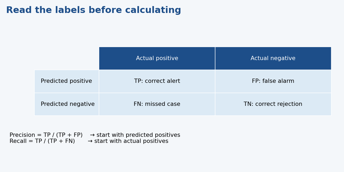
First define which category counts as “positive.” For injury prediction, take injured as positive.
Actually positive
Actually negative
Predicted positive
True positive (TP): correctly flagged injury
False positive (FP): false alarm
Predicted negative
False negative (FN): missed injury
True negative (TN): correctly ruled out
Metric
Formula
Question it answers
Accuracy
(TP + TN) / total
What fraction of all predictions were correct?
Precision
TP / (TP + FP)
Of the positive predictions, how many were correct?
Accuracy can hide poor performance when classes are imbalanced. If 99% of athletes are uninjured, always predicting “uninjured” gets 99% accuracy but misses every injury. Precision and recall reveal the problem. Which metric matters most depends on the consequences of false alarms and missed cases.
5. Sports example: injury classification
The slides describe Rommers et al.: preseason measurements in 734 youth football players, followed for a season. Predictors included anthropometry, growth/maturity, coordination and physical performance. The targets were injury yes/no and, in a second model, overuse versus acute injury.
They used XGBoost, with 80% of records for training and 20% for testing. Understand why this is supervised classification: the outcomes supply known labels, and predictions are checked against those outcomes.
SHAP plots help interpret the model. Features are ranked by their overall impact; each plotted observation has a SHAP value showing its contribution toward or away from an outcome. Colour represents the feature value. A feature that helps prediction is not automatically a cause of injury.
The lecture’s conclusion is that ML can support injury screening and risk management, while still requiring sensible evaluation and interpretation.
6. k-means: find groups without labels
k-means tries to make observations close to their own cluster’s centroid, the mean location of its members. It minimizes the total within-cluster sum of squared Euclidean distances.
Choose the number of clusters, k.
Initialize k centres.
Assign every observation to its nearest centre.
Recalculate each centre from its assigned observations.
Repeat assignment and updating until assignments stabilize or the iteration limit is reached.
Different starting centres can lead to different results, so repeat with several starts. The slides discuss choosing k using an elbow/scree plot, silhouette scores, and NbClust indices. These help compare possible solutions; they do not reveal one unquestionable “true” grouping.
Scale matters. A feature with a large numerical range can dominate distance calculations. Standardize variables when their units/scales would otherwise give them unintended influence. The slides also show that the way features represent the data matters, for example Cartesian versus polar coordinates.
Inspect cluster size, separation and overlap. k-means favours compact, roughly spherical clusters; a neat plot alone does not establish meaningful athlete types.
7. PCA: represent the data with fewer dimensions
Principal component analysis (PCA) constructs new axes from combinations of the original variables. PC1 captures the greatest possible variance; PC2 captures the greatest remaining variance while being perpendicular to PC1, and so on.
Loadings: how the original variables contribute to a component.
Scores: each observation’s position on a component.
Eigenvalue: the variance associated with that component.
Explained variance proportion: the eigenvalue divided by the sum of all eigenvalues.
For eigenvalues 18 and 4, PC1 explains 18/(18+4) = 81.8%, and PC2 explains 18.2%. Keeping a few components can preserve much of the variation while reducing dimensions. PCA does not directly predict injury and does not itself assign cluster membership.
8. Sports example: clustering cyclists
The slides describe van der Zwaard’s cyclist example: cluster athletes using body size, composition and shape, then examine cycling disciplines and performance after forming the clusters.
Three anthropometric clusters emerged. Sprint cyclists were grouped together; pursuit and road cyclists were distributed across the two endurance-type clusters. Sprint/endurance performance differences matched the broad body-type expectations, but clustering did not simply reproduce the three discipline labels.
That is the lesson: unsupervised analysis can reveal similarities that differ from the categories you started with.
Reading plots and output: what the sample adds
Elbow plot: the vertical axis usually measures within-cluster variation. Increasing k reduces it; look for the bend after which additional clusters yield much smaller improvements. You do not choose the largest k just because it gives the smallest within-cluster variation.
Silhouette plot: when the plot shows average silhouette score against k, higher scores indicate better within-cluster cohesion relative to other clusters. Consider k at the peak. Elbow and silhouette can suggest different solutions; identify which plot you are reading and explain its evidence.
Confusion-matrix output (the example exam): check row/column headings and the named positive class. The sample says Positive Class: No, so its sensitivity concerns correctly identifying “No”, even if “Yes” feels more natural. Its accuracy is about 0.787, compared with a no-information rate about 0.532. A small p-value is not itself a measure of predictive usefulness. For the sample's multiple-choice item the marked answer emphasizes accuracy; in practice also consider class-wise performance and uncertainty.
Open question (the example exam): give the distinguishing feature and one example of each method. Classification learns injury labels; clustering discovers athlete profiles from measurements without known profile labels. Saying that both “divide people into groups” misses the important difference.
A worked decision-tree split
Suppose a parent node has eight observations, four in each class. Its Gini impurity is 1 − (4/8)² − (4/8)² = 0.5.
A candidate split creates a left child with three yes and one no, and a right child with one yes and three no. Each has impurity 1 − 0.75² − 0.25² = 0.375. The weighted score is (4/8) × 0.375 + (4/8) × 0.375 = 0.375. This improves on the parent's 0.5. A perfect split into two pure children would score 0.
For a numerical feature, sort the observed values and consider cutoffs between adjacent distinct values. With observed ages 20, 24 and 30, possible cutoffs include 22 and 27. Evaluate the class mixtures induced by each candidate. Use child sizes as weights; an unweighted average can favour a misleading split when the children are unequal.
KNN classifies from nearby labelled observations. A random forest combines predictions from multiple trees. A decision tree is easy to follow but can overfit if it grows too much. These are methods for the same supervised categorical-target problem, rather than different lifecycle stages.
Read metrics from counts, not from position
Different software can put predictions in rows or columns. First read both axis labels and the positive class. Positive does not have to mean injury/yes: software may treat “No” as positive. Then identify TP, FP, FN and TN and calculate the relevant denominator.
Specificity is TN/(TN+FP): how many actual negatives are correctly rejected. Balanced accuracy averages sensitivity and specificity and gives the two classes equal contribution. The predictor-free majority-class accuracy is a useful comparison in an imbalanced dataset. An impressive accuracy is not enough if the clinically important class is missed.
F1 combines positive-class precision and recall. It does not include true negatives directly, so it is not the answer to every evaluation problem. Interpret the metric according to what mistakes matter.
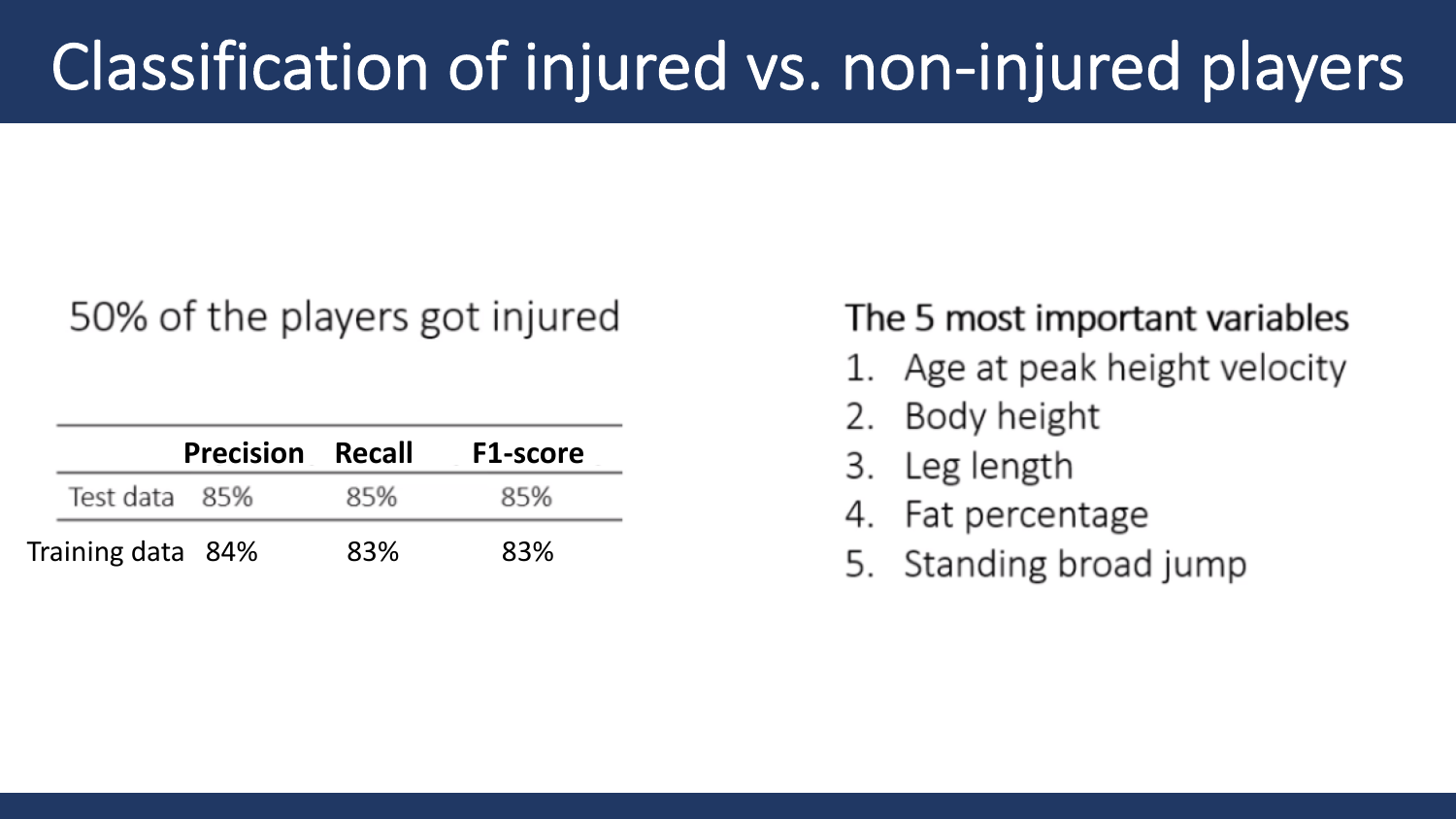
The Rommers case's displayed training metrics are precision/recall/F1 about 84%/83%/83% for injury status and 82%/82%/81% for overuse versus acute injury. Those values describe training results as labelled; they must not be substituted for unseen-test performance. The rendered injury-status figure separately reports test precision/recall/F1 of about 85% each. Its listed influential variables include age at peak height velocity, body height, leg length, fat percentage and standing broad jump. These are predictive importance results in this study, not established causes.
Choosing and interpreting clusters
The within-cluster sum of squares normally falls as k increases because more centres can fit the observations more closely. Therefore “choose the lowest sum” would tend to favour too many clusters. The elbow looks for a point after which improvements become relatively small; the bend can be ambiguous.
A silhouette compares an observation's average distance to its own cluster with its average distance to the nearest alternative cluster. Values near +1 indicate good separation, around 0 a boundary/overlap, and negative values a possible mismatch. An average silhouette can compare candidate k values; it is evidence, not a guarantee of meaningful groups.
NbClust compares multiple clustering indices. Agreement is helpful, while disagreement requires judgment and context. Feature representation matters: Cartesian versus polar coordinates, choice of variables and scaling can alter the distances and resulting groups.
PCA projections can make a cluster plot readable but omit information. If two plotted PCs explain only part of the variance, overlap in that picture may not tell the whole high-dimensional story. Conversely, a visually separated plot does not independently validate athlete types. Size is one of the lecture's three clustplot criteria: along with little overlap and roughly spherical shapes, clusters of more or less similar size indicate a good clustering. k-means does not mathematically force equal sizes, but in an exam answer treat similar size as a sign of good clustering.
The cyclist case measures size (mass, height, body surface area), composition (skinfolds, fat and muscle) and shape (endomorphy, mesomorphy, ectomorphy). Performance comparisons include Wingate, vertical jump, a 15 km time trial and VO₂max. Clusters were formed from anthropometry before examining disciplines. Sprint cyclists grouped together; pursuit and road riders appeared across two clusters. Three anthropometric groups did not mean perfect recovery of the three discipline labels.
PCA: keep the geometry clear
Centre the data, then find the direction of greatest projected variance for PC1. PC2 is perpendicular and captures the greatest remaining variance. Loadings are weights, not labels. Scores locate observations on the new axes. Component signs can be reversed without changing the information.
The renumbered deck uses an example combining height and weight, followed by eigenvalues 18 and 4. The 81.8% for PC1 refers to a share of variance, not an 81.8% classification accuracy. Retaining two of five components that explain over 90% of variance reduces dimension but loses the remaining variance, which could still matter for a specific prediction task.
Try the interactive explanation
Open the metrics, k-means and PCA page. Adjust a confusion matrix, run successive k-means steps and see PCA axes on the same invented points. The page separates classification counts from clustering and variance; they are not interchangeable outcomes.
From the recording
Points the lecturer made in the lecture recording on Canvas that are not (fully) on the slides. Times refer to the recording.
02:01 — The 'ultimate' underfitting model is the naive baseline: no predictors at all, just predict the training-set mean for every new case. It has no complexity, so it has high bias and performs poorly on both the training and test sets. Any real model should beat it. (not on slides (Slides p. 9–10 define under/overfitting but give no such example))
04:03 — How to read the bullseye figure: high bias means the hits are systematically off target (away from the centre), and high variance means they are spread out. Low bias with high variance is scattered around the centre; high bias with low variance is a tight group in the wrong place. The goal is low bias and low variance, a tight group in the bullseye. (Slides p. 11 (four bullseye images with labels, not explained))
06:07 — Regularization: 'I'm not expecting you to know all about regularization, but what you need to know' is the direction. Decreasing regularization lets the model learn the training set better, which fixes high bias. Increasing it reduces model complexity, which fixes high variance. 'New model architecture' means switching to another model family, e.g. neural networks/deep learning or ensemble methods. Complexity can mean a more complex algorithm or more parameters/predictors. (Slides p. 12, 14 (flowchart lists the remedies without explaining regularization))
10:12 — k-fold CV builds k separate models, and you report their average score. Validation accuracy differs between folds because each fold holds different data. The average is less dependent on how one split happened to fall. k = 5 or 10 is used because it gives low test error while staying computationally feasible; k = 100 is possible but slow. (Slides p. 20 (k = 5 or 10, 'lower test error'; averaging and computation not stated))
12:17 — Make the split based on the target. If a random holdout split put all intensive-interval sessions in the training set and no extensive ones, the model could not learn to predict the extensive class. Arrange/partition on the target, e.g. createDataPartition(model_data$training_type, p = 0.7), so that every class (or every RPE value) appears in both training and test sets. For the course assignment a single holdout model is enough if the target is well distributed. (not on slides (code on Slides p. 25 partitions on the target without saying why))
14:25 — Answer to the two '?' on the 'good practice' slide. The outer split of all data into training and test data is the holdout method. The inner scheme on the training data is 5-fold cross-validation, used to find/optimise the (hyper)parameters. The test data is used once for the final evaluation. This is the typical set-up in a data-science project. (Slides p. 22 (figure shows two question marks instead of the method names))
16:25 — Explicit exam hint for Exercise 3 (70/30 split, random forest, 10-fold CV, caret train()): 'this is what I expect you to more or less know also for the exam.' Know these parts: createDataPartition(target, p = 0.7) makes the split. trainControl(method = 'cv', number = 10) sets 10-fold CV. In train(training_type ~ ., data = train_data, method = 'rf', trControl = fitControl), ~ . means all other columns are predictors (or list them as var_a + var_b), 'rf' is random forest (any classifier, e.g. logistic regression, could go there), and CV runs only on the training data. You do not need to know metric = 'ROC'. (Slides p. 24–25 (exercise and code shown, not explained))
20:35 — Fraud example for accuracy: fraud occurs in less than 1% of cases, so a model that always predicts 'no fraud' is 99% accurate but useless. Use accuracy when the dataset is balanced. When it is imbalanced, be cautious and prefer F1, which the lecturer called 'the most important one' for now. Balanced accuracy was mentioned as another option. A confusion matrix needs the true labels, so this is supervised learning (the transcript says 'not supervised', a slip). (Slides p. 27, 33 ('Risk with unbalanced datasets', 'Better metric for imbalanced datasets'; fraud example and balanced accuracy not on slides))
28:45 — Rommers et al. interpretation: 50% of players got injured, so the dataset is balanced and the choice of metric hardly matters; precision, recall and F1 were all 85% on the test set. Training scores (84/83/83%) were almost identical to test scores, slightly lower but negligibly so. So there was no overfitting or underfitting: 'they made a pretty good model'. (Slides p. 47 (numbers only, no interpretation))
30:45 — Reading the SHAP plot: dots right of 0 push the prediction towards 'injured' and dots left of 0 towards 'not injured'. Red means a high feature value and blue a low one. Example: more football experience (red on the right) means a higher predicted injury risk, plausibly through more exposure. Longer dribbling-without-ball times (red on the left) push towards not injured. Caution: the lecturer said higher Sprint 20 m values mean more injury and explained it by 'fast, explosive players' being injury-prone. Sprint is in seconds, so a higher value is a slower sprint, and that explanation contradicts the unit. Always check the unit before interpreting. (Slides p. 48–50 (reading rules on p. 48; worked examples not on slides))
32:46 — Overuse vs acute model: the lecturer said '74% overuse injuries, meaning 53% acute', a slip. The slide says 47% overuse, so 53% were acute, which is roughly balanced. Test precision, recall and F1 were all 78%, and training scores were 82/82/81%. The similar values again indicate no clear under- or overfitting; performance was only slightly lower than the injury model's. (Slides p. 51 (47% overuse; train and test values; no interpretation))
34:48 — Why the injury model is 'not the holy grail': it used a single preseason baseline measurement to predict a whole season, so temporal aspects (changes during the season) were not modelled. It is a good start and useful for screening and informing coaches. (Slides p. 53–54 ('not the holy grail' without the reason))
50:16 — Choosing k: the elbow in a scree plot is subjective, so confirm it with other methods. In the silhouette plot you want the highest peak. In the slide example the elbow and the silhouette peak agree on k = 5. NbClust bundles the elbow, silhouette and many other indices and counts how many indices favour each k (k = 2 in its example). These methods give a starting point, not a final answer. (Slides p. 62–64 (plots shown; subjectivity and 'two methods confirming' not stated))
54:23 — Input representation matters. For ring-shaped data in Cartesian (x, y) coordinates, k-means cuts the rings into segments that 'make no sense', because it forms compact groups by Euclidean distance. The same points in polar coordinates (angle and distance from the centre) give three clear clusters, the rings. (Slides p. 65 (both plots shown without explanation))
54:23 — Scaling before k-means: the algorithm only sees numbers, so a variable in large units (height in cm rather than inches, or height next to weight) dominates the distances. All variables should contribute equally. Dividing by the maximum removes units but not differences in spread. Z-scores (mean 0, SD 1; z = 1 is one SD above the mean) make every column contribute equally, which is why the lecturer preferred them. (Slides p. 66–67 (units matter, z-score formula; max-normalisation comparison not on slides))
56:26 — Judging a clustplot (worked example): the 5-cluster plot is a poor clustering because the green and blue clusters overlap almost completely, so points in one cluster are not different from the other. Good clusters show minimal overlap, roughly spherical/elliptical shapes (not lines) and similar sizes. A thin, line-shaped cluster of a few points is driven by single (possibly outlying) points, which makes it hard to assign new athletes to it, and it is essentially one-dimensional. (Slides p. 68 (criteria listed; the overlapping 32.6% plot is stacked under the 52.15% plot in the PDF))
60:26 — PCA intuition: it compresses many columns (e.g. 200) into a few components that still hold most of the variation. Projecting x–y points onto PC1 turns 2-D data into 1-D data. PC1 is like the Deming regression from the regression lecture because it uses perpendicular (orthogonal) distances to the line, not the vertical distances of ordinary least squares. (Slides p. 71–74 (definition and projection figures; Deming link not on slides))
62:30 — 'That is very important': a clustplot's axes are the first two principal components. Check the stated % of variability they explain: 52.15% in one example, 32.6% in the other, and 85% in the cyclist study. A low percentage means the 2-D picture misses much of the variation, so the visible overlap or separation may not reflect all dimensions. You want a high percentage. (Slides p. 68, 84 (percentages printed under plots; the emphasis is verbal))
64:36 — Cyclist study. Somatotypes: an ectomorph is long and lean, a mesomorph muscular and V-shaped (power/speed athletes), and an endomorph rounder with more body fat. The clustering was judged good: NbClust gave 3 clusters, the plot explains 85% of the variance, and the clusters do not overlap, are roughly spherical and are of similar size. If the clusters had matched the disciplines, anthropometry would 'tell the same story' as discipline. Instead, sprinters formed one cluster while pursuit and road riders mixed across two clusters (tall vs short), matching the literature that pursuit and road cyclists have similar anthropometry. (Slides p. 80, 83–91 (somatotype figure unlabelled; evaluation and literature reason verbal))
Slide coverage map
The Canvas-linked presentation retains the older lecture number 8: first part covers classification, generalization, validation, metrics and the football injury case; second part covers k-means, PCA and the cyclist case. The supplementary concept slides (an older version of this deck from the Canvas course files) pages 15–22 add trees and Gini; pages 53–61 add the numerical/geometric PCA walkthrough.
Worked through the deep dive?Tick it off. Come back to any section whenever you need it.
3Step 3 of 35–8 min
Practice questions
Exactly two original practice questions. These use the concept/application style of the 2024 and 2022–2023 example exams, with new scenarios and values. Try each before opening its answer. The official example exams are on Canvas; save them for a later, exam-style session.
Question 1 — Interpret classifier performance
Take injured as positive. A test set has TP = 18, FP = 6, FN = 12 and TN = 64. Calculate accuracy, precision and recall. Which metric directly describes how many injured athletes were detected?
Show answer and rationale
Accuracy = (18+64)/100 = 82%. Precision = 18/(18+6) = 75%. Recall = 18/(18+12) = 60%. Recall directly measures detection of actual injured athletes. Rationale: precision starts from predicted positives, whereas recall starts from actual positives. Accuracy alone obscures the twelve missed injuries.
How did your answer compare?
Question 2 — Distinguish clustering and PCA
You group rowers using body measurements without giving the algorithm discipline labels. An elbow plot bends near k = 3, but mean silhouette is highest at k = 2. A two-PC plot explains 72% of variance and shows overlap. Explain what method family this is and what you can conclude about the number and separation of groups.
Show answer and rationale
Unsupervised clustering, such as k-means. The elbow and silhouette supply different evidence, so compare k = 2 and 3 with stability, compactness and domain meaning; do not claim a uniquely proven k. PCA supplies a lower-dimensional representation and does not assign clusters itself. Rationale: 72% retained variance is not accuracy, and omitted dimensions mean visible overlap is useful evidence but not the entire geometry. Labels examined afterward can help interpret groups without turning the fitting into supervised classification.