First read: about 4–6 minutes. Lecture 4: Preparation exploration and visualization.
Preparation makes data usable; exploration helps you understand it; visualization makes the pattern explainable. The Olympics examples show why units, context, sample size and chart interpretation matter before modelling.
The ideas to keep
Blur the explanations and test yourself.
Measurement scales. Nominal categories have no order; ordinal categories have order; interval values have meaningful differences; ratio values also have a meaningful zero.
Quality and FAIR. Check completeness, uniqueness, timeliness, validity, accuracy and consistency. FAIR means findable, accessible, interoperable and reusable; restricted data can still be FAIR.
Joins. Match tables using appropriate keys. A left join keeps the left table; an inner join keeps only matches. Repeated keys can multiply records.
EDA. Inspect structure, summaries, missingness, distributions and relationships. Investigate unexpected values in context and return to cleaning when needed.
Read graphs. Boxplots show quartiles/median, violins show smoothed density, scatterplots show paired values. An outlier flag is not proof of error; correlation is not proof of causation.
ggplot. Build a plot from data, aes mappings, geoms and optional facets/statistics/scales/themes. Colour mapped inside aes differs from a fixed colour outside it.
What to be able to do
Be able to read/complete a small dplyr pipeline, choose a join or graph, identify scales and interpret a plot without overclaiming. The example exams indicate question styles, not an exhaustive syllabus.
Got the big picture?Mark the overview done to fill this lecture's ring.
2Step 2 of 312–18 min
Detailed notes
Source:full presentation. Canvas lecture page checked 11 October 2026, 11:40 CEST. Existing lecture transcript used to clarify demonstrations; its older administrative dates are excluded. Examples labelled “illustration” are invented to explain the slide concepts.
The aim: make data usable, inspect it, then explain it
The lecture moves through preparation → exploration → visualization. These stages feed back into each other. A plot can reveal an impossible value, leading you back to cleaning; cleaning can reveal the need for a new feature.
“Garbage in, garbage out” means sophisticated models do not fix fundamentally wrong measurements, units or records. Preparation often takes much of the work. Standardize formats and units, ensure consistent types/scales, organize records and split complex fields where needed.
Measurement scales determine what calculations mean
Scale
What is meaningful
Example
Important limit
Nominal
Same/different category
Discipline, injury type
No inherent order
Ordinal
Category plus order
Bronze, silver, gold
Gaps are not known equal quantities
Interval
Order and equal differences
Celsius temperature
Zero is conventional; 20°C is not twice as hot as 10°C
Ratio
Equal differences and meaningful zero
Height, mass, elapsed duration
Ratios such as twice the duration are meaningful
A category encoded as a number can still be nominal or ordinal. Assigning bronze 1, silver 2 and gold 3 does not make the medals an interval quantity. The choice of scale affects summaries, graphs and modelling.
Six data-quality dimensions
Dimension
Question
Illustration
Completeness
Are required values present?
Missing heights or missing sessions
Uniqueness
Are entities/records accidentally repeated?
The same session imported twice
Timeliness
Is the information appropriate for the time required?
An athlete's outdated weight
Validity
Does it obey the defined type, format and range?
Dates parse correctly, allowed category labels
Accuracy
Does it match reality?
A mistyped but plausible height can be valid and inaccurate
Consistency
Do representations agree?
The same person's date of birth differs across files
The slide's biological consistency example is a prompt to investigate conflicting records, not a rule for invalidating someone based solely on a category label. Always interpret the definition and context of the recorded variables.
An extreme value is not automatically an error. The Olympics demonstrations show a very light young gymnast, a very tall basketball player and an old participant connected to historical art competitions. Context explains values that initially look suspicious. Investigate before deleting.
FAIR data
Findable: data and metadata can be located, ideally using a persistent identifier and meaningful indexing.
Accessible: users can retrieve data through a defined procedure. Access can be restricted for privacy; accessible does not mean public to everyone.
Interoperable: data use shared, understandable formats/vocabularies so they can work with other data.
Reusable: sufficiently clear descriptions, provenance and use conditions allow appropriate reuse.
Illustration:height = 180 without units or protocol is hard to reuse. A data dictionary saying “standing height in cm, measured without shoes using protocol X” supplies meaning. FAIR supports reproducibility but does not by itself prove the measurements are correct.
Wrangling with dplyr
A data frame stores observations in rows and variables in columns. The following examples use a small invented athlete table so every operation is easy to follow.
arrange(desc(age)) reverses the sort. filter(year == 2008 | medal == "Gold") uses or: either condition is enough. & means both must hold. select() is about columns; filter() is about rows.
The pipe %>% passes the result on its left to the next function. Read a pipeline from top to bottom as sequential instructions.
BMI uses height in metres. A centimetre/metre error changes the squared denominator enormously. After creating a feature, inspect whether the values make sense.
athletes %>%
  group_by(sport) %>%
  summarise(records = n(),
            mean_age = mean(age, na.rm = TRUE),
            .groups = "drop")
# sport records mean_age
# row         2       24
# run         2       25
n() counts rows, including rows with missing age. The rowers' mean age uses only the one observed age. There are two records but not two observed ages. In the historical Olympics data, a row can be an athlete-event entry, so counts are not necessarily counts of unique people. Check the unit of observation.
The slide exercises select Games city, sort years, convert a height column to numeric, convert cm to m, calculate BMI, filter year/medal, and summarize count and mean age per medal. Converting a factor directly with as.numeric() can produce level codes; inspect and convert the intended labels carefully.
Joining tables through keys
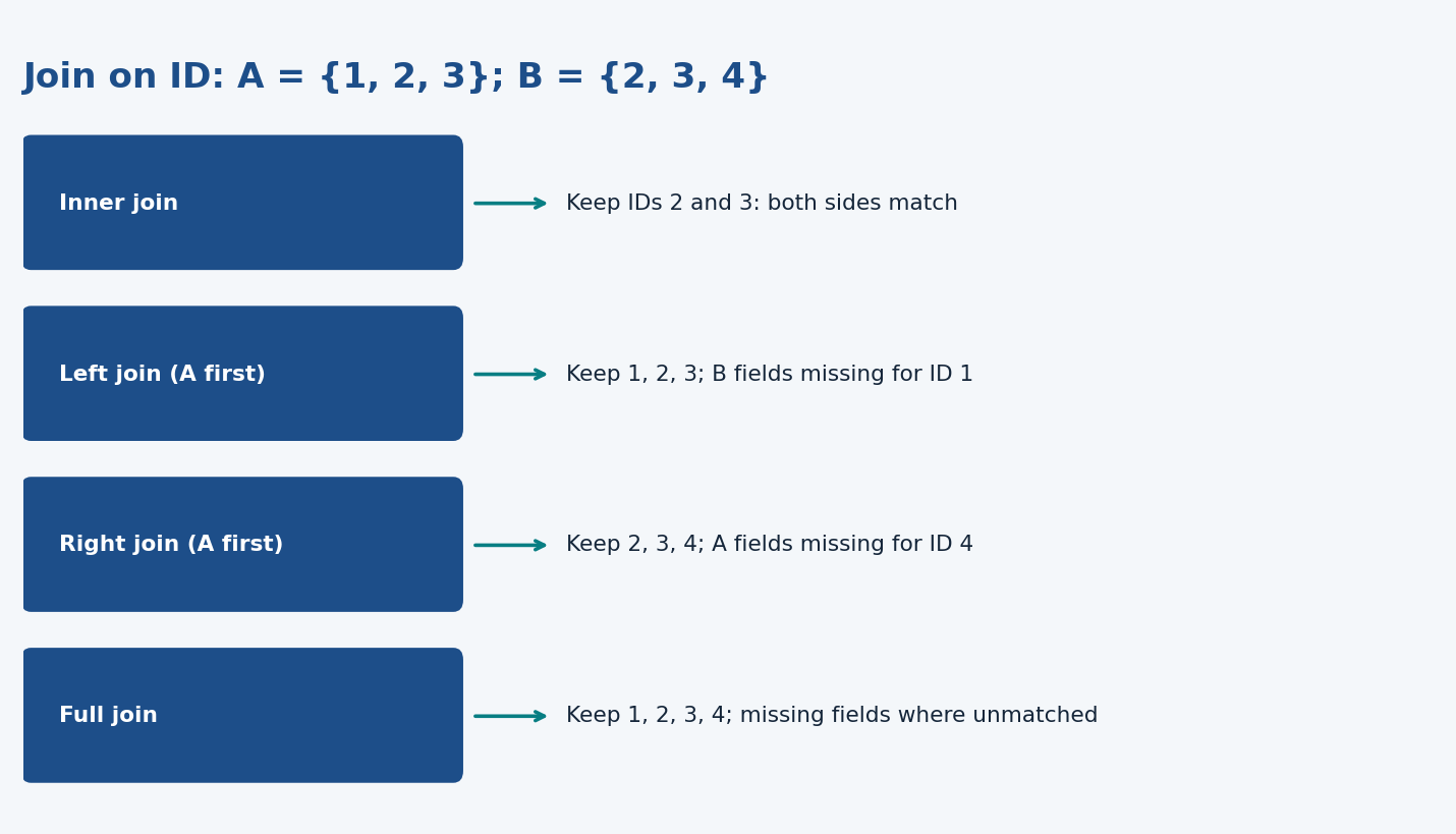
Suppose table A has athletes with IDs 1, 2, 3, and table B has test values for IDs 2, 3, 4.
Join
IDs kept
Consequence
Inner
2, 3
Only matches in both tables
Left, A first
1, 2, 3
Keep every A record; B value is missing for ID 1
Right, A first
2, 3, 4
Keep every B record; A value is missing for ID 4
Full
1, 2, 3, 4
Keep records from either table
left_join(athletes, tests, by = "id")
# If the names differ:
left_join(athletes, tests, by = c("id" = "athlete_id"))
Keys can include several variables, such as athlete ID plus date. Software can infer shared names, but you should check that the inferred columns really define a match. Repeated keys can multiply rows: if an athlete has three test records, a join may produce three rows for that athlete. That can be appropriate or accidental depending on the question.
Duplicates and missing values
duplicated(x) marks repeated elements/rows. unique(x) returns unique values/rows. distinct(data, ...) keeps distinct combinations of specified columns. Removing duplicate athletes without considering event or date can destroy valid repeated observations.
colSums(is.na(athletes))
This counts missing cells in each column. It does not explain why they are missing. Use is.na(x), not x == NA: comparing an unknown value does not yield a usable true/false decision. Lecture 7 develops imputation; here, first understand the pattern and its implications.
Exploratory data analysis: inspect before assuming
Size and structure:dim(), nrow(), colnames(), head(), str().
Simple summaries:summary(), means, medians, SD, ranges and missingness.
Distributions: histograms, boxplots and violin plots.
Relationships: scatterplots and correlation plots.
Investigate surprises: use context and return to preparation when needed.
EDA aims to expose underlying structure, important variables and potential problems, and generate hypotheses. It is iterative; it does not merely certify that the data are ready.
The Olympics examples explore changing participation, age distributions and champions, height/weight, and missingness. Early female-athlete distributions may look unstable because participation was small. Differences between graphs can reflect sample size or changing composition, not just a real shift in the phenomenon.
Read the charts
Chart
What it shows
What to inspect
Line plot
Values over an ordered sequence, often time
Units, gaps and comparability across years
Histogram
Counts/density in numerical bins
Shape, spread, bin width and sample size
Bar plot
Counts or values for categories
Whether bars represent counts or summaries
Boxplot
Median, quartiles and possible outliers
Q1, Q3, IQR and whisker rule
Violin
Smoothed distribution density
Shape depends on smoothing and sample size
Scatterplot
Pairs of numerical measurements
Trend, groups, extremes and range
Correlation plot
Pairwise association coefficients
Sign/strength, scale and missing-data handling
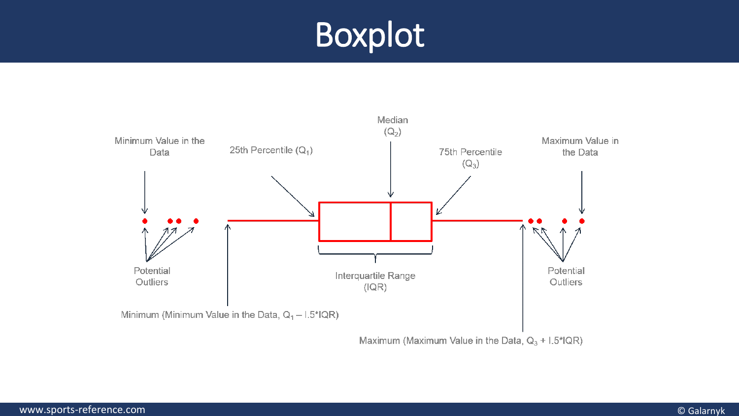
Boxplot: the box spans Q1 to Q3, the central 50% of observations. The line marks the median. IQR = Q3 − Q1. Under the common rule, whiskers extend to the most extreme observations within 1.5 IQR of the box; more distant points are flagged. Whiskers are not invariably minimum/maximum. A flagged value may be real.
Violin: greater width means greater estimated density around that value, not a larger numerical measurement. A violin and a boxplot can complement each other: one shows distribution shape, the other compact summaries.
Correlation: positive values mean the variables tend to increase together; negative values mean one tends to decrease as the other increases. A coefficient near zero means little linear association; nonlinear patterns may still exist. Correlation does not establish causation. The slide's humorous correlations show how unrelated trends and many comparisons can produce impressive-looking relationships.
For a simple ordinary linear regression with an intercept, R² = r²; r is not itself explained variance. That relationship does not apply indiscriminately to every model. The slides explicitly correct a mistaken explained-variance label.
Build a ggplot from layers
library(ggplot2)
ggplot(mpg, aes(x = displ, y = hwy)) +
  geom_point()
mpg is the example dataset; displ is engine displacement and hwy highway mileage. aes() maps variables to visual properties; geom_point() draws points. + adds layers, unlike the dplyr pipe's sequential data processing.
ggplot(mpg, aes(displ, hwy, colour = class)) +
  geom_point()

# Alternative: one panel per class
ggplot(mpg, aes(displ, hwy)) +
  geom_point() +
  facet_wrap(~ class)
aes(colour = class) assigns colours according to categories. geom_point(colour = "blue") sets one fixed colour. Putting a literal colour inside aes() usually maps a category label instead of simply setting the colour.
Layer/concept
Role
Data
Table containing the observations
Aesthetics
Map x, y, colour, size, shape, alpha or group
Geometries
Points, lines, bars and other visible marks
Facets
Separate panels by group
Statistics
Derived summaries, smooths or intervals
Scales
Map data values to positions/colours, labels and breaks
Coordinates
Define the plotting coordinate system/view
Themes
Non-data appearance, fonts, background and layout
Scales and coordinate systems are related but distinct. A theme makes the plot readable; it does not change the observations. Choose a chart for the question, label units, simplify distractions, use deliberate accessible colour and make the message interpretable without an oral explanation.
Dashboards and communicating results
A dashboard combines relevant indicators, filters and visualizations. The transcript's volleyball example uses jump measurements, distributions and trends, with athlete/date filtering and annotations for coaches. An R Shiny interface can make these interactive. The purpose is to support understanding and decisions, rather than add interaction for its own sake.
From the recording
Points the lecturer made in the lecture recording on Canvas that are not (fully) on the slides. Times refer to the recording.
04:07 — Data preparation typically takes 60–80% of a data scientist's time. (not on slides)
05:57 — 'Aggregate into bins' means grouping values into intervals, as a histogram does; the same idea is used later to create features. (Slides p. 6 (term only))
08:30 — Temperature in °C is interval (arbitrary zero); a scale with an absolute zero (Kelvin, height, weight) is ratio. The recording garbles this, so follow the slides. (Slides p. 7 and 9)
09:15 — Ordinal values cannot be added or subtracted because the gaps between categories are not equal; mean and SD are only meaningful for interval and ratio data, and the coefficient of variation only for ratio data (lecturer: 'definitely remember this one'). (Slides p. 9 (table; emphasis is verbal))
10:30 — Missing values are not always bad: keeping impossible values (age 300) can be worse, and missingness can itself carry information, e.g. Medal = NA (85% of rows) means 'no medal' and can be recoded with ifelse(is.na(Medal), 'No medal', Medal). (Slides p. 10 and 31 (code shown, reasoning verbal))
12:02 — Identify duplicates using several columns together, because single columns such as age repeat naturally; how many 'duplicates' you find depends on which columns you keep (a gymnast's six identical rows were six different events). (Slides p. 29)
14:05 — FAIR in practice: add a metadata file describing each column (content, type, range); give the dataset a DOI (Digital Object Identifier) in a repository; store metadata in machine-readable XML for interoperability; attach a licence for reuse. (Slides p. 12 (principles only))
54:22 — The pipe %>% passes the processed data frame into the next function as its first argument, so in data %>% filter(...) %>% nrow() the nrow() call needs no argument. (Slides p. 22)
93:15 — Spurious correlations (e.g. cheese consumption vs bedsheet deaths, r ≈ 0.95) arise easily when there are few data points; correlation does not imply causation. (Slides p. 53)
95:25 — Good visualisation: account for colour-blindness, use large fonts, make figures self-explanatory; in dashboards put the key performance indicators on top. (Slides p. 58)
Slide coverage map
Pages 1–12: preparation, scales, quality and FAIR; 13–31: dplyr, pipes, summaries, joins, duplicates and missingness; 32–53: EDA and Olympics chart examples; 54–73: effective visualization and ggplot layers/exercises. The transcript adds the contextual outlier examples and volleyball dashboard demonstration.
Worked through the deep dive?Tick it off. Come back to any section whenever you need it.
3Step 3 of 35–8 min
Practice questions
Exactly two original practice questions. These use the concept/application style of the 2024 and 2022–2023 example exams, with new scenarios and values. Try each before opening its answer. The official example exams are on Canvas; save them for a later, exam-style session.
Question 1 — Choose the measurement scale
A symptom questionnaire records “none”, “mild”, “moderate” or “severe”. Which scale applies to this recorded variable?
A. Nominal.
B. Ordinal.
C. Interval.
D. Ratio.
Show answer and rationale
B. Ordinal. There is an order, but the gaps between categories are not defined as equal amounts. Coding them 0, 1, 2, 3 would not establish interval or ratio properties.
How did your answer compare?
Question 2 — Read and explain a grouped summary
The table has three records: sport A, age 20; sport A, age NA; sport B, age 30. Predict this output and explain why the count and mean for A use different numbers of observed ages.
A: records = 2, mean_age = 20. B: records = 1, mean_age = 30.n() counts rows, including the row with missing age. The mean omits that unknown age and uses only observed values. Rationale: a row count is not automatically a count of nonmissing measurements, so summary denominators need attention.